Android YouTube app get a new look in fullscreen mode.
The YouTube app for Android will receive a new look when videos are viewed in full screen, according to 9to5Google. If while watching a YouTube video on your phone on landscape and you press pause, you’ll notice something different.
New Look Of The Android Youtube App

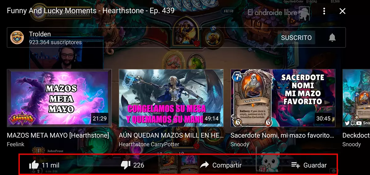
On the left side, at the bottom, there are thin outlines having new icons that allow you to comment about the video, like or dislike it, share with someone else or add it to a playlist.
While on the bottom right of the full screen view, there is an icon that’s showing multiple videos in fullscreen mode together with the words: “More Videos, Tap to see all.”
When you tap on it, a carousel comes up that displays other videos that you might find interesting. The video timeline is moved a little bit higher and the icon settings containing three-dot on the upper right corner is turned into the gear icon solely used to represent the settings menu on several other apps.
Lastly, clicking on the small upside down pointer, right next to the title of any video will bring up the description of it with the total number of likes, views, and the date the video was initially posted on YouTube. It’s at that point some videos will have a written description and some will be made easier to navigate by breaking them down in chapters.
You can also visit our telegram channel for more updates https://t.me/droidvilla

Sounds quite interesting. 👍🏾