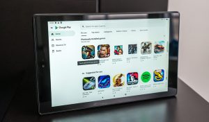
Google has been giving its applications and services the Material You makeover since last year. There is still some work to be done even if the procedure is nearly finished. According to 9To5Google, Material You is now available on the Google PlayStore for tablets and Chromebooks.
Last year, Google released Material You. The company completely turned around its design to provide us with a more bubbly and rounder UI. Even better, it was given an iF Gold Design Award. Now, Material You will be available on the PlayStore for Tablets and Chromebooks there will be a significant redesign of the Google Play Store.
This was shown off during this year’s Google I/O. It is intended to improve it for smartphones with bigger screens. This is a component of Google’s effort to improve Android for tablets. There is still time to wait on that, though. Google is providing Material You for the Play Store on tablets and Chromebooks in the meantime.

The UI hasn’t seen a lot of changes, but they are still visible. To begin with, the search bar is no longer a rounded rectangle but is now shaped like a pill. Instead of a bottom bar, the navigation is now a drawer on the side of the screen. The UI that emphasizes the part you’re in will be colored to match the theme of your device.
More About The New Material You Feature On The PlayStore for Tablets and Chromebooks

This also applies to the navigation drawer. You’ll notice the bigger navigation bar at the bottom of the screen when you turn your smartphone into portrait mode. All of these UI changes are small, but they demonstrate that Google is still paying attention to tablets and Chromebooks.
Google released Material You to the Play Store for smartphones back in October, but prioritizing phones makes sense. In due course, the Play Store will receive the new layout. People will be eager to give it a try once it happens. It will almost certainly look excellent on the Pixel Tablet when it is released next year.
Join Our Telegram Channel For More Exciting Updates Via The Link Below ⤵️
