Google said that the Google Home app would be redesigned to be more user-friendly. It’s a much-needed update for the app because users have long wished for a less congested view feed. The updated Google Home feed is already going out to devices, according to 9To5Google.
Sometimes, user interface design may be difficult. The goal of designers is to offer as much content as they can on a single screen. They must, however, take care not to clog the screen. In order to maximize information without tiring the eyes, a delicate balance must be struck.

Devices Are Receiving The Google Home Feed Update
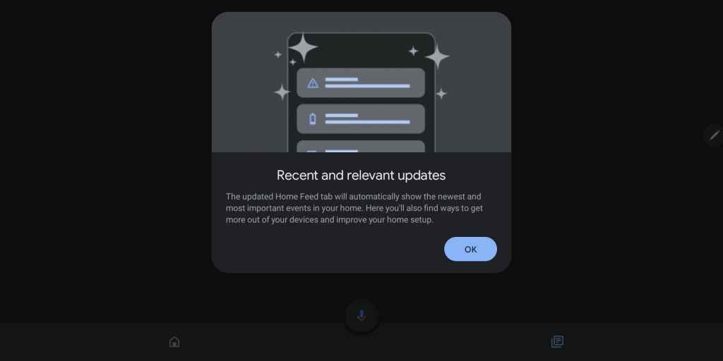
You should be thrilled about this if you frequently use Google Home. Delivering the most crucial information first and foremost is its main goal. Additionally, the organization intends to declutter your perspective.
In the previous view, various elements on the screen are shown as cards in a grid. It’s all a vertical scroll with the new Google Home feed. Your priority events will be displayed first when you launch the app. Your security alerts and any other messages the software considers significant will be included in these.

When it comes to notifications from your camera, there will be an image attached. This is excellent for giving you a sense of what’s happening. You’ll see more possibilities to engage with the notice when you tap on it.
Additionally, you may catch up on events by viewing the history of your most recent notifications. The news feed’s primary objectives are to offer information on these topics, and its new clutter-free layout does just that. By clicking the button in the top left corner of the screen, you may enter the settings if you wish to change anything about the feed.
You must wait for this update to reach your device since it is currently being sent out. You should keep an eye out for any changes over the next several weeks as it is rolling out to both Android and iOS smartphones.
Join Our Telegram Channel For More Exciting Updates Via The Link Below ⤵️
