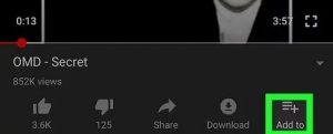
Say hello to some fresh button designs below every video on YouTube. For a popular app as YouTube, one would think its design would be set in stone.
Instead, It’s constantly been changed by Google and adapting it to fit whatever niche the company has become obsessed with.
Material You makeover is yet to be received by a Google but some new buttons on testing on Android makes us wonder if it’s not too far away.
YouTube is giving the row of buttons below a video an all-new look, directly pulled from the material Design 3 guidelines released back in October.
Even if the thin line-art icons are sticking around, they’re now surrounded by pill-shaped bubbles, including a combined tab for likes and the newly-hidden dislike count – As spotted in Telegram Group of Google News.
More About The New Look Of YouTube’s Video Row Of Buttons

The result of video row of buttons looks a little odd right now, basically shrinking the height without compressing any information.
Instead of using these new buttons to eliminate the need to scroll between options, YouTube actually lengthened the bar, placing text like “Download” next to its similar icon rather than below it.
This hindrance seems more like a limitation of Material Design 3 (officially the design name for Material You) than any other thing, as keeping the current layouts of the buttons would require an outline that’s circular rather than the pill shape used in Google’s updated apps through out.
Be do not know when these buttons might make their way to users. But, dynamic themes and redesigned navigation bar aren’t far behind anymore.
Join Us On Telegram For More Exciting Updates
